If your business has multiple locations and you want to quickly understand which branches are performing better, or which products are selling the best, simply looking a full page of spreadsheet data can be overwhelming and difficult to grasp. Converting your data into a visual chart can help you search and organize key information more intuitively.
If you just want to quickly create simple charts, Ragic's built-in reporting features may be just what you need— equipped with line graphs, pie charts, bar charts, and other charting tools that are easy to create and analyze.
In case you need something more complex and interactive, such as integrating data from multiple spreadsheets and creating dashboards, Ragic now integrates directly with the free Google Looker Studio, empowering you with the tools you need from data management to visualization.
(If you prefer to use Power BI for data visualization, you can also integrate Ragic with Power BI.)
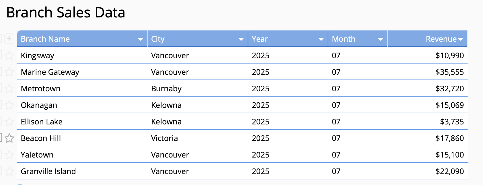
If you have a monthly branch performance chart like the one below— which includes the store name, city, and monthly performance— and you want to use Google Looker Studio to create a bubble map like the one above, a revenue comparison chart, or even a sales analysis by product, how can you do it?
It only takes a few simple steps, and we'll walk you through them using a real-world example below.
At the very least, you'll need branch sales data and product sales data in order to create 3 types of analytical charts such as branch sales map, performance comparison chart, and best-selling product rankings. Note that Google Looker Studio supports analysis of regular independent fields, but not Ragic subtables. Therefore, the data you want to analyze cannot be stored in Ragic subtables. If you need to analyze subtable fields, you can use the New Sheet from Subtable feature to transfer the subtable data into independent fields in a new sheet for analysis. Before creating charts on Google Looker Studio, make sure the data you need is not stored in subtables.
For example, in the branch sales data sheet below, the red box represents regular independent fields that can be analyzed. These fields include information such as the branch name, location, and monthly sales amount for each branch. These can serve as a source data for monthly revenue analysis or performance bubble map on Google Looker Studio. On the other hand, the blue box contains subtable data that cannot be directly analyzed. Hence, visualizing the best-selling products on this sheet is not possible, and you would need to covert subtable to new sheet before performing the analysis.
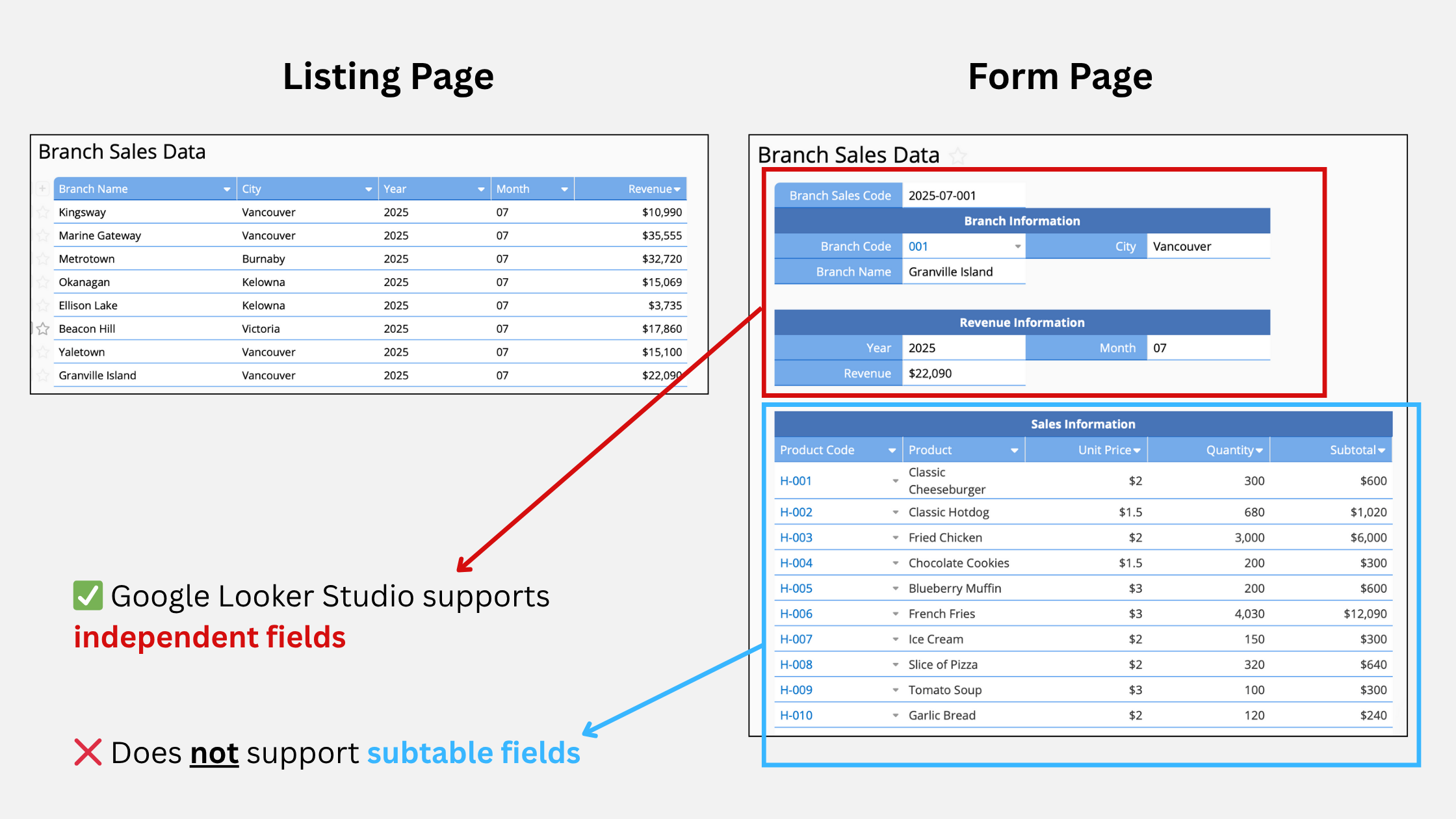
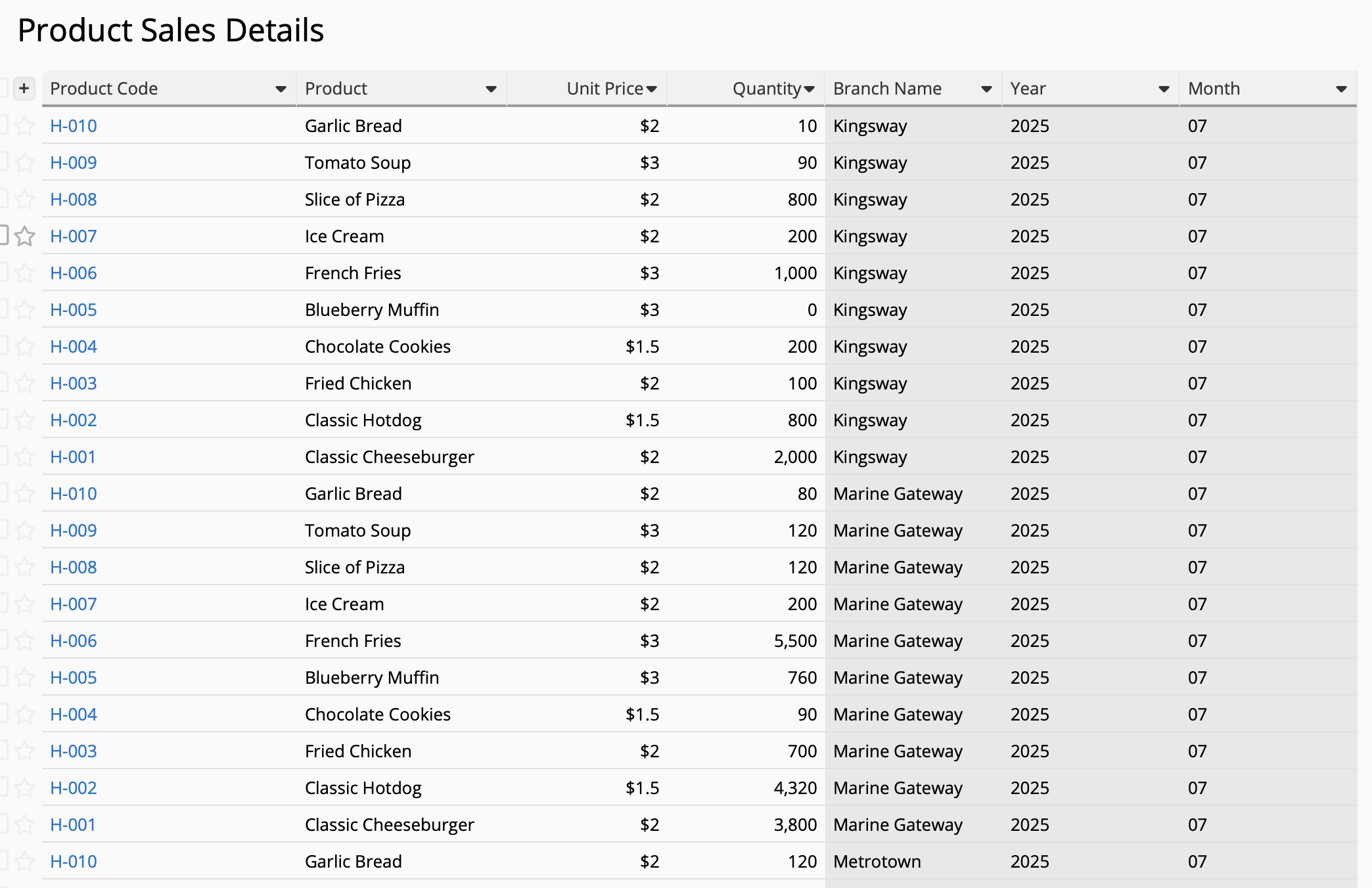
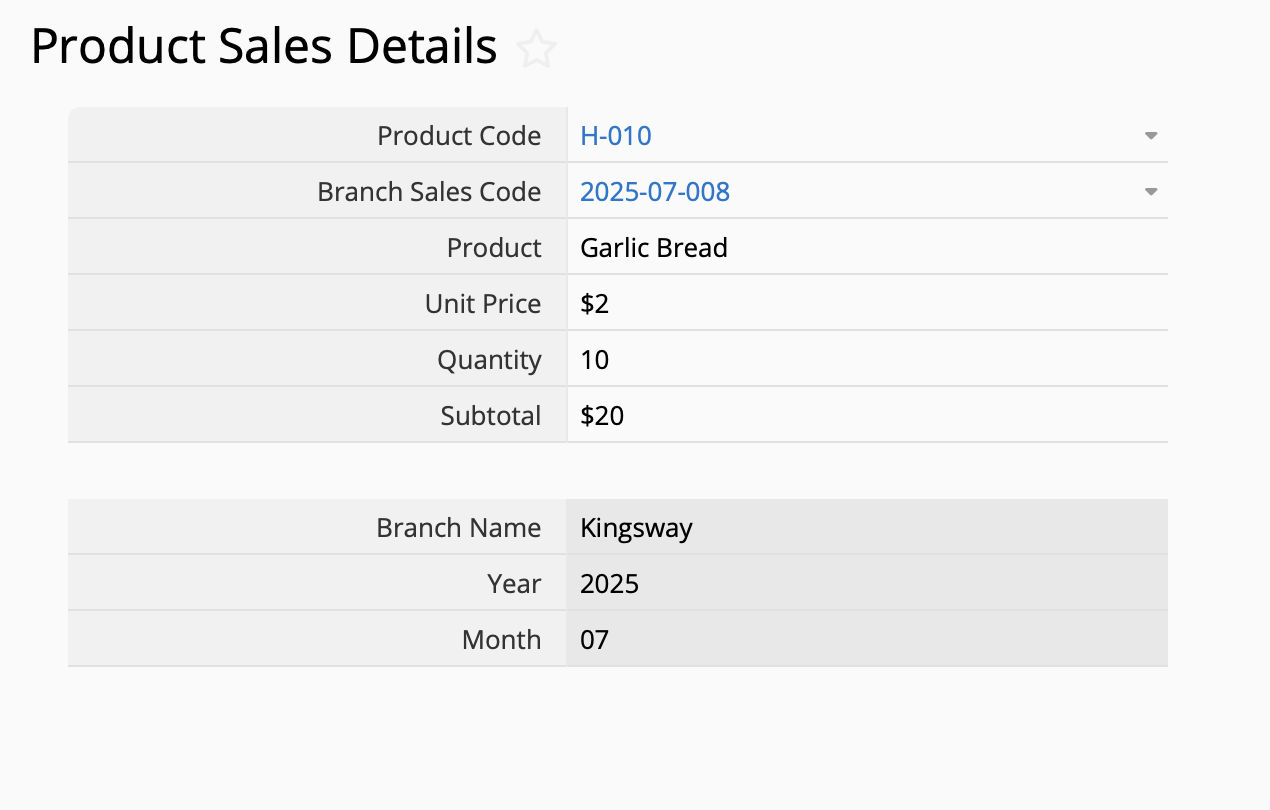
Use the "New Sheet from Subtable" function to create a detailed product sales sheet like the one below, with columns listing the quantity and total amount of each item sold, along with the store where the item was sold. This sheet can then be analyzed and used as source data for best-selling product types.
If you don't have data yet, we've prepared a sample data sheet containing the two sheets mentioned above: (1) Product Sales Details. You can directly download the listing page data and import them back into your Ragic account to try out.
Simply select "Tools" > "Download as Excel" from the list page of both sheets then import them into your own database to create these 2 sheets. If you use the sample data, make sure the field type matches the data format (ie. Free Text, Number, Money, etc.) when importing, since Looker Studio integration requires that they match. If you'd like to create simple data linking relationships like in the sample data sheet, please refer to the extended topic tutorials at the end.
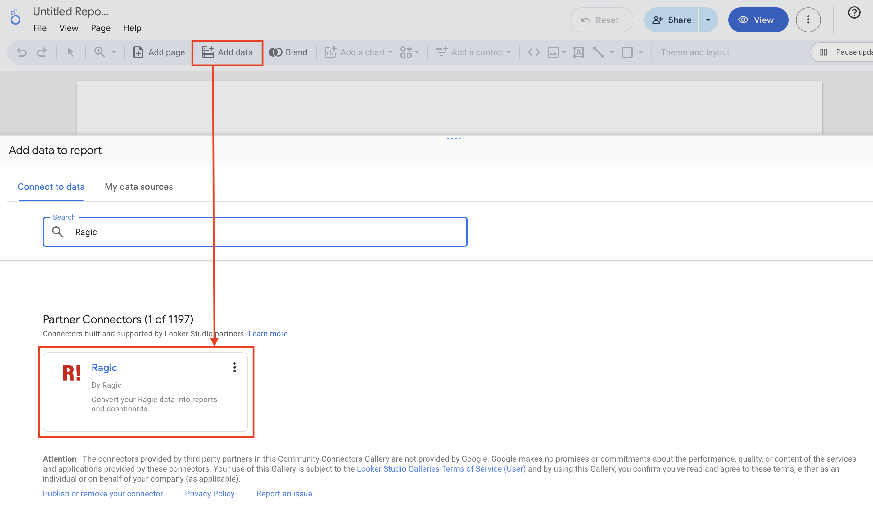
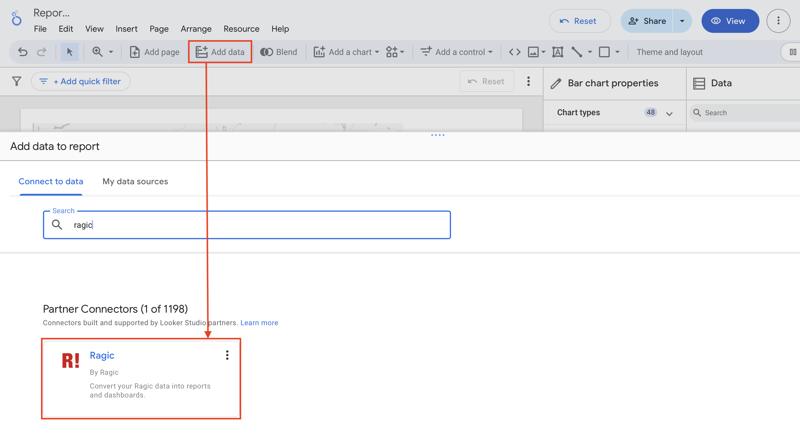
1. Please refer to 👉🏻 this integration article. Search for and select Ragic on the "Connect to Data" page in Looker Studio to start the integration. You can also click "Add Data" when creating a report and search for Ragic from the pop-up window. Google authentication screen will pop up the first time you use it. Select "Authorize" to grant access to your data.
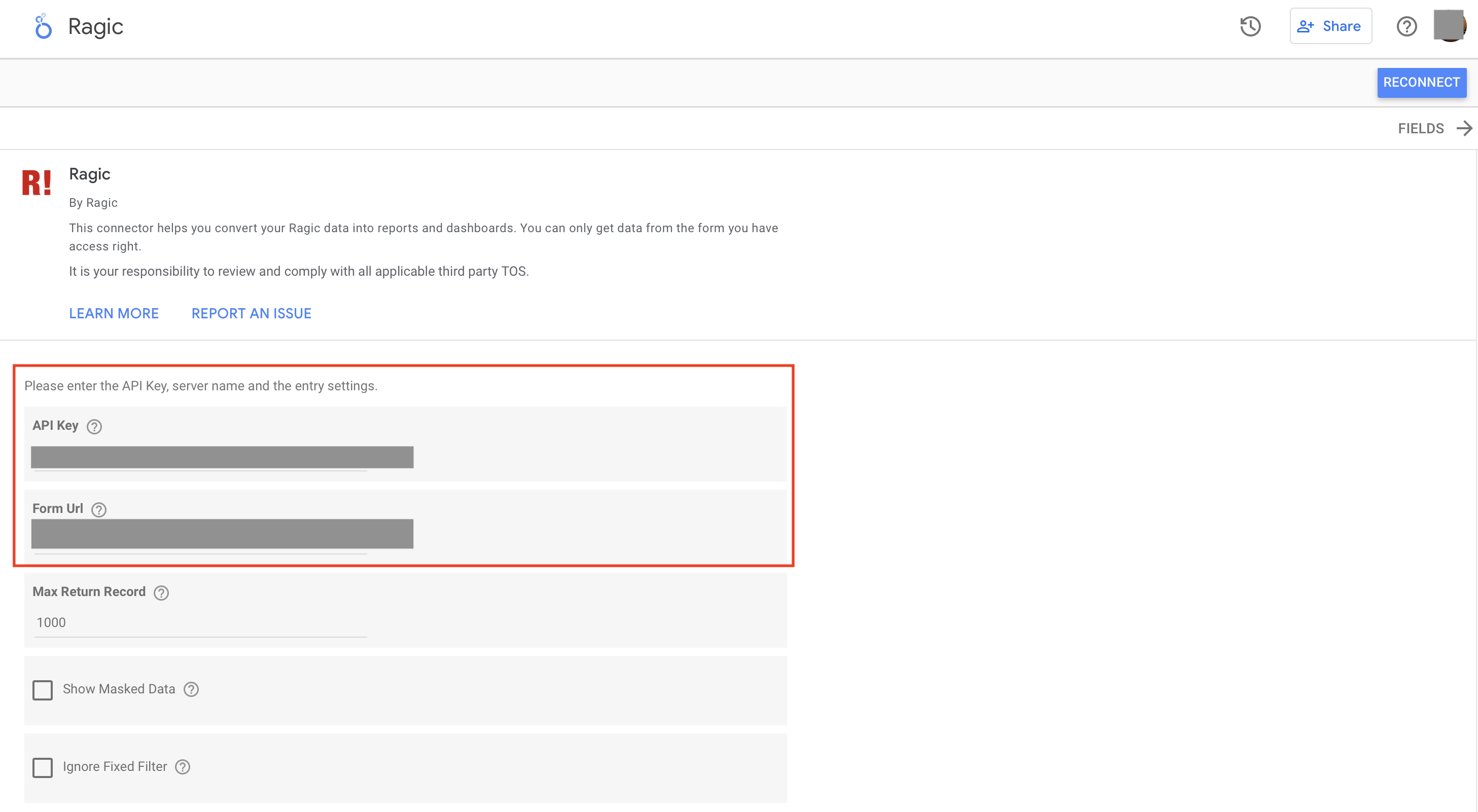
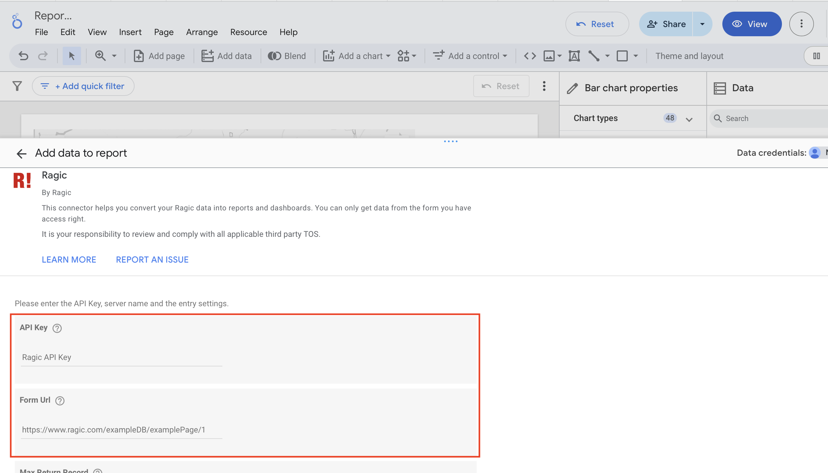
2. Next, set up the connection by referring to Step 3 in the article above. Enter your API Key and Form URL. The API Key can be obtained from your Ragic "Personal Settings" and the Form URL is the URL of the sheet you wish you connect to. For example, we'll use the "Branch Sales Data" sheet as the source form.
You can also adjust the advanced options to suit your needs, such as whether to set a maximum number of records to return per request, whether to display the actual value of text-masked fields, and whether to ignore fixed filter conditions on the form.
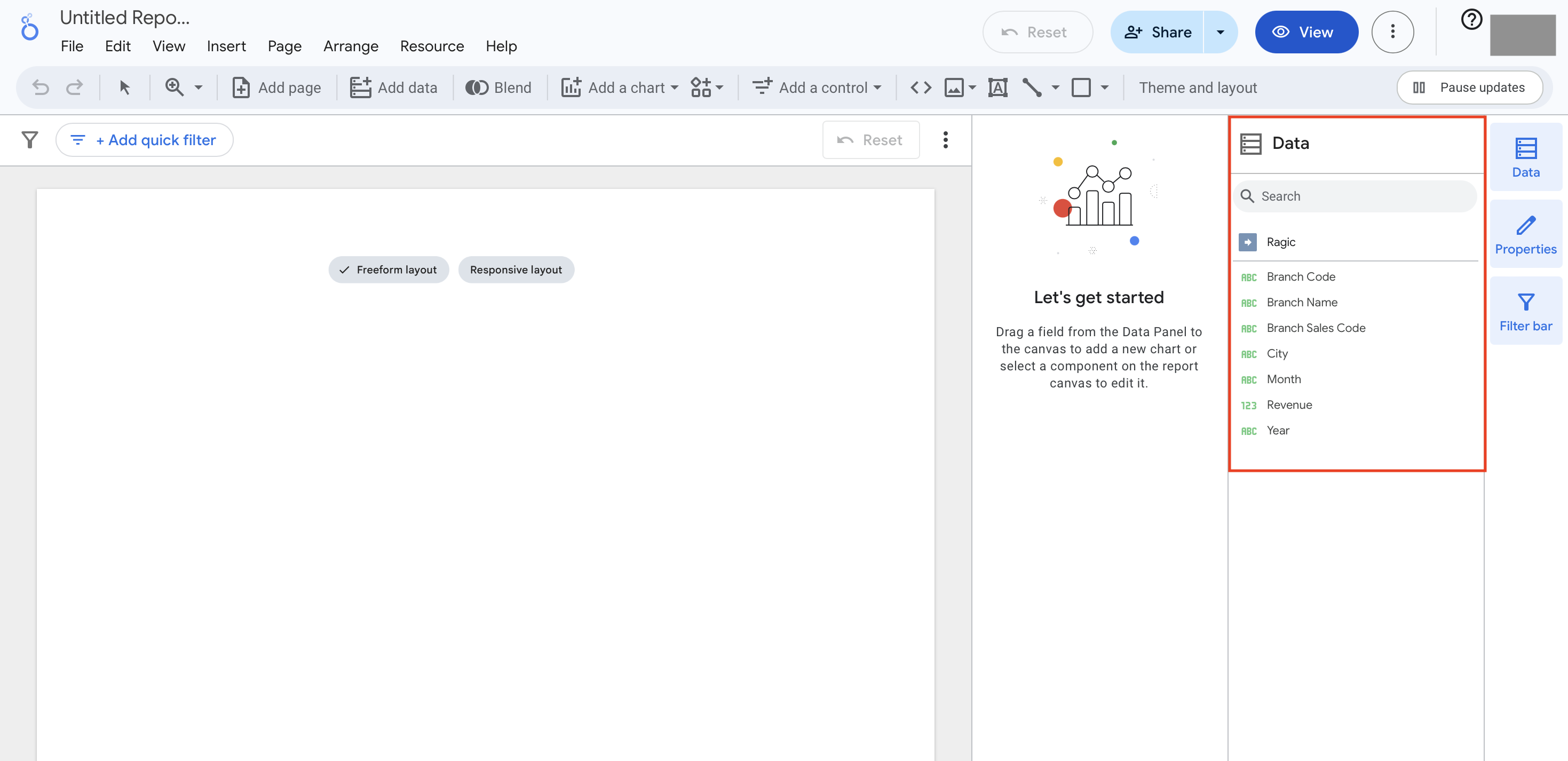
3. Once the connection is successful, you'll see a "Data" section on the right side of the report, displaying the fields from your Ragic sheet (subtable data are currently not supported). Click "Create Report" and select the chart type you want to use to start building your dashboard!
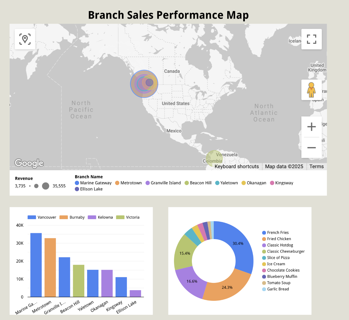
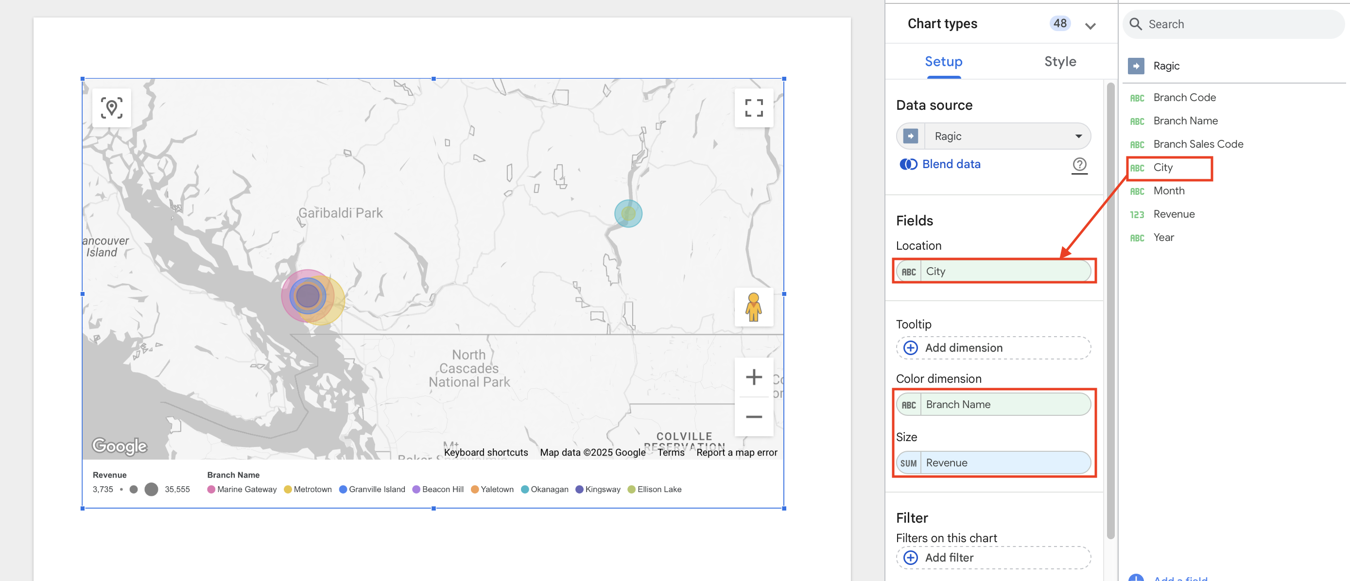
If you want a more intuitive representation of each store's location and revenue performance, you can use a Bubble Map Chart. By adjusting the size of the dots on the map, you can clearly show the differences in performance among branches. To create one, follow these steps:
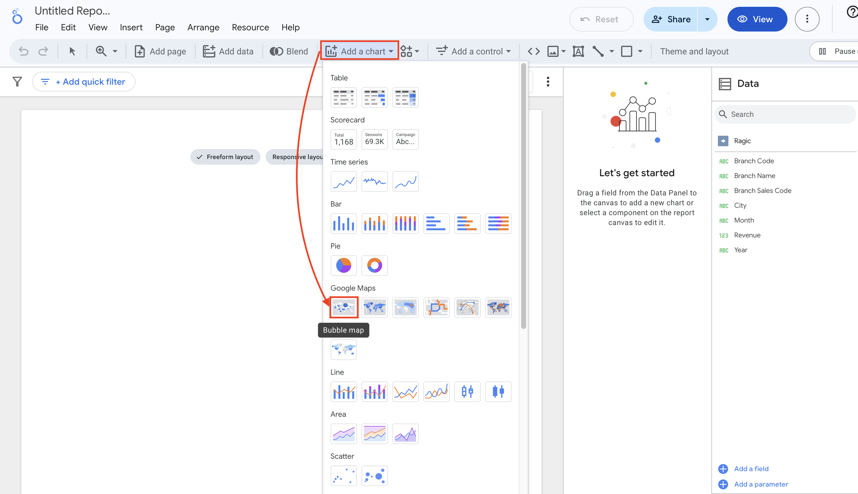
1. On the report page, click "Add Chart" > Select a Google Maps chart style.
2. Use your mouse to drag the map to the area where you want to it placed.
3. After adding the chart, simply drag the "City" field to the "Location" field in the chart. Drag the "Branch Name" field to the "Color Dimension" field in the chart. Then drag "Revenue" to the "Size" field of the chart. You can then create a bubble map like the one below, which can quickly show you how sales revenue is distributed by branch!
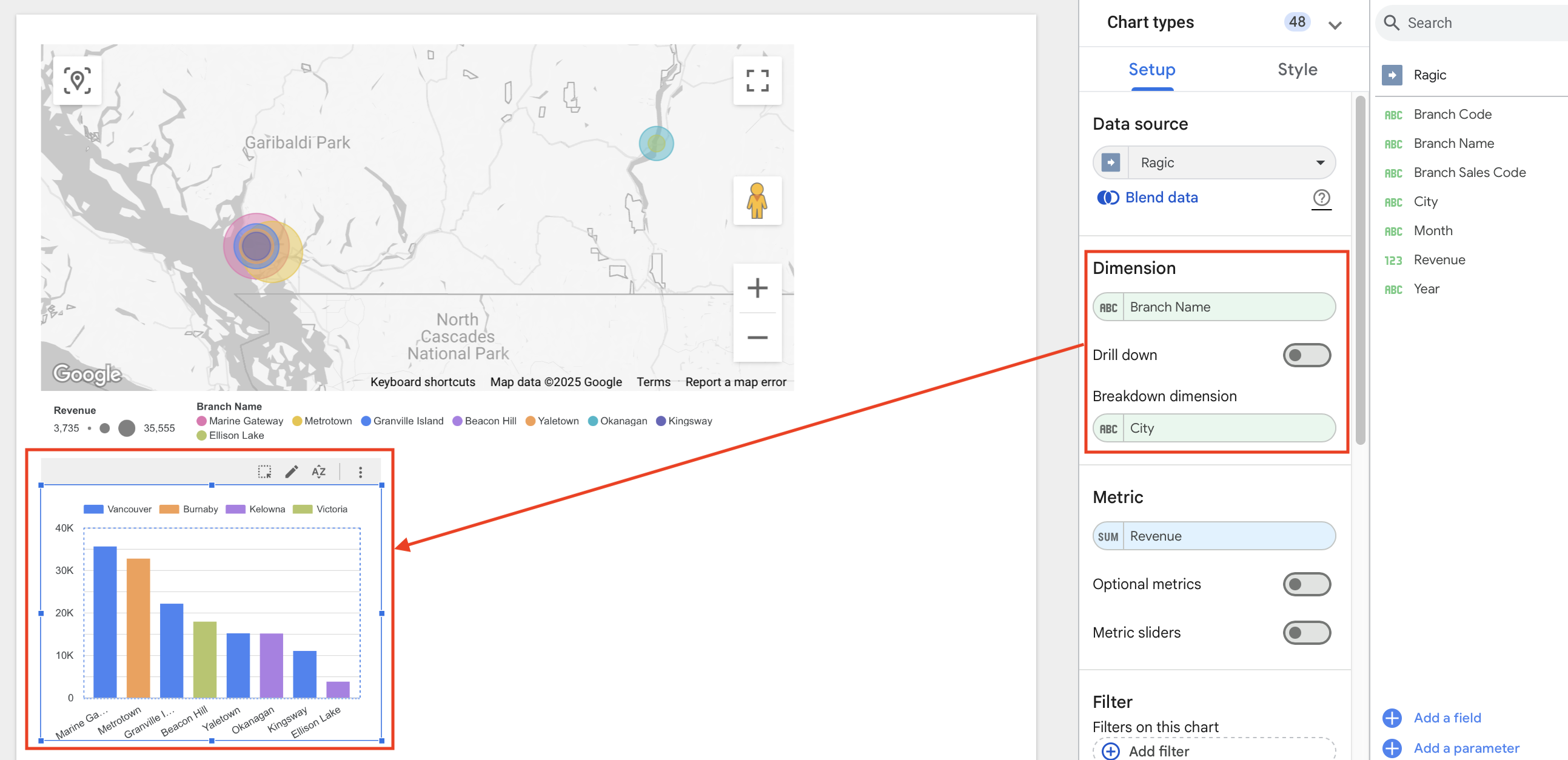
1. If you want to add a bar chart to your report to compare the performance of each branch, click "Add Chart" and select the "Stacked Vertical Bar Chart."
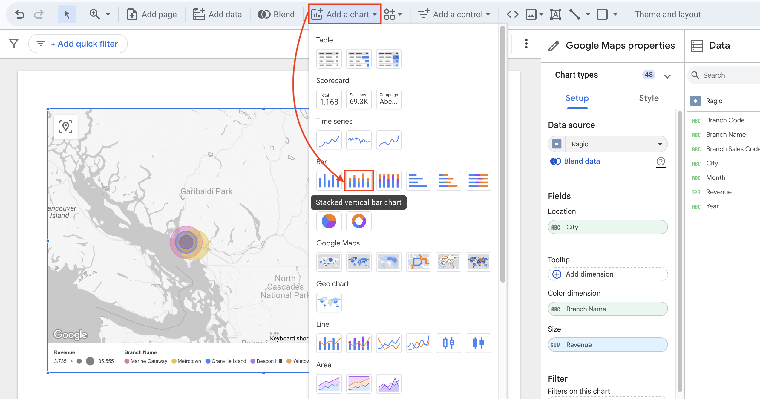
2. Drag the chart to the desired area on the page. The system will automatically create a new bar chart based on the data.
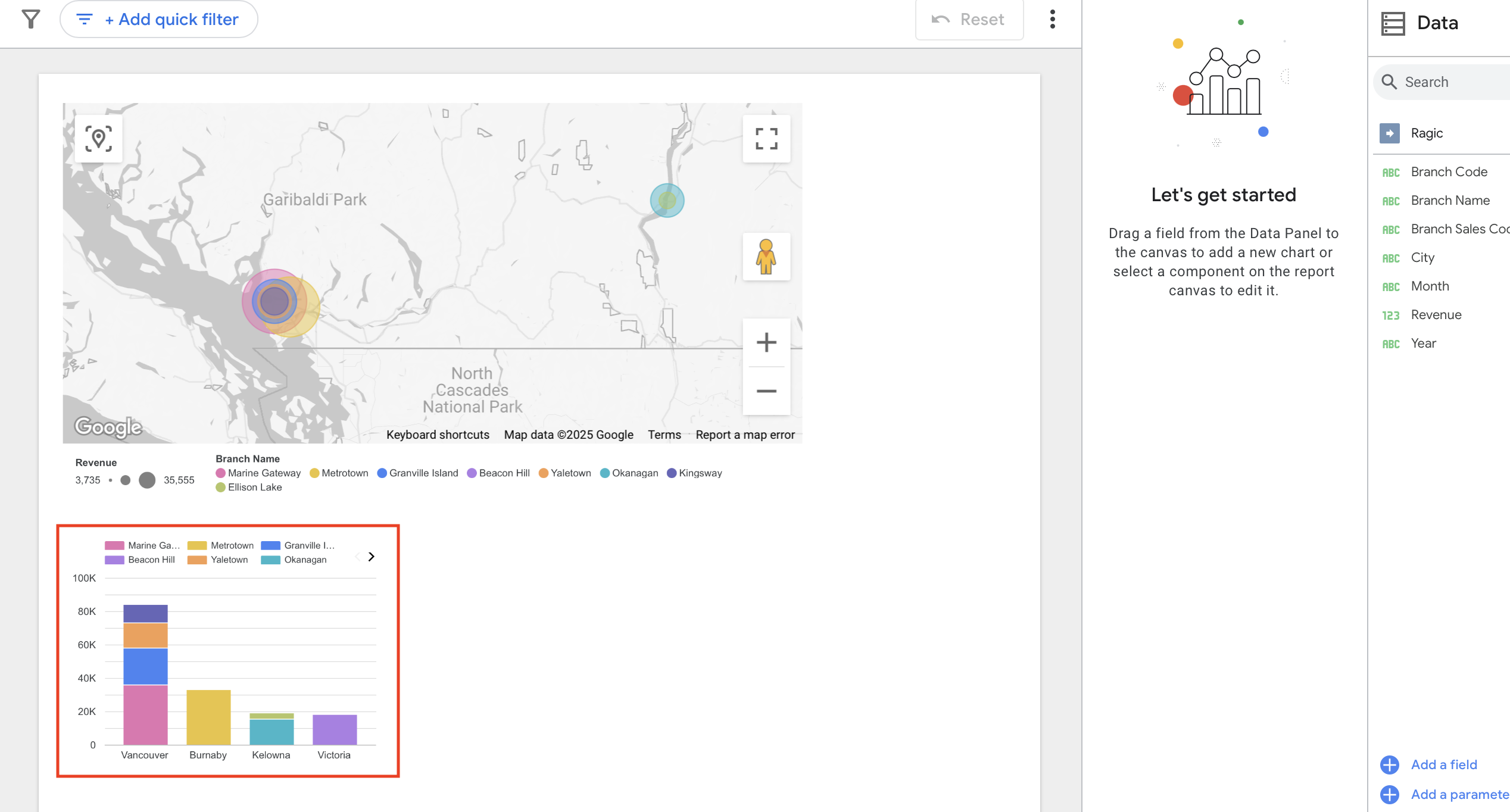
3. Next, you can customize the X-axis dimension and breakdown dimension below it. Set the "Dimension" as "Branch Name" and "Breakdown Dimension" as "City." You'll then see a chart comparing branch performance, like the example below. Feel free to adjust the settings according to your needs.
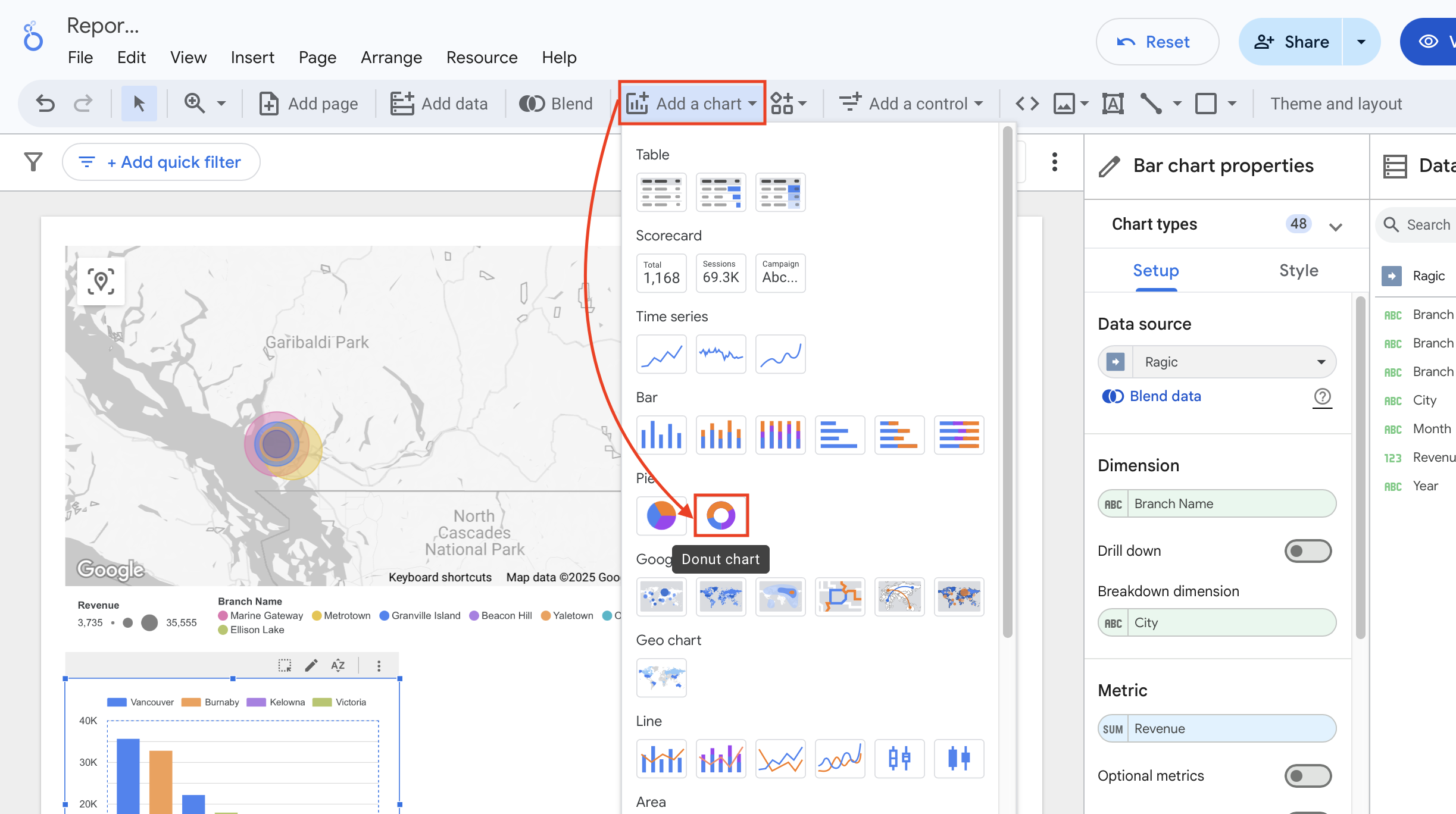
1. To create a chart analyzing best-selling products, we'll need to use data from the "Product Sales Details" sheet. Because this is a separate sheet, we'll need to first click "Add Data" above on the report, search for Ragic, and select it as a data source.
2. Next, enter your Ragic API and the URL for the "Product Sales Details" sheet. Configure the advanced options below, if needed. Once completed, click "Add" to successfully connect your data.
3. After the connection is made, click "Add Chart" and select "Donut Chart" as the analysis chart.
4. The system will automatically generate a preset Donut Chart based on your data. However, you may notice that the preset chart uses "Product Code" as the dimension and "Unit Price" as the metric, which does not accurately represent the total sales volume for each product.
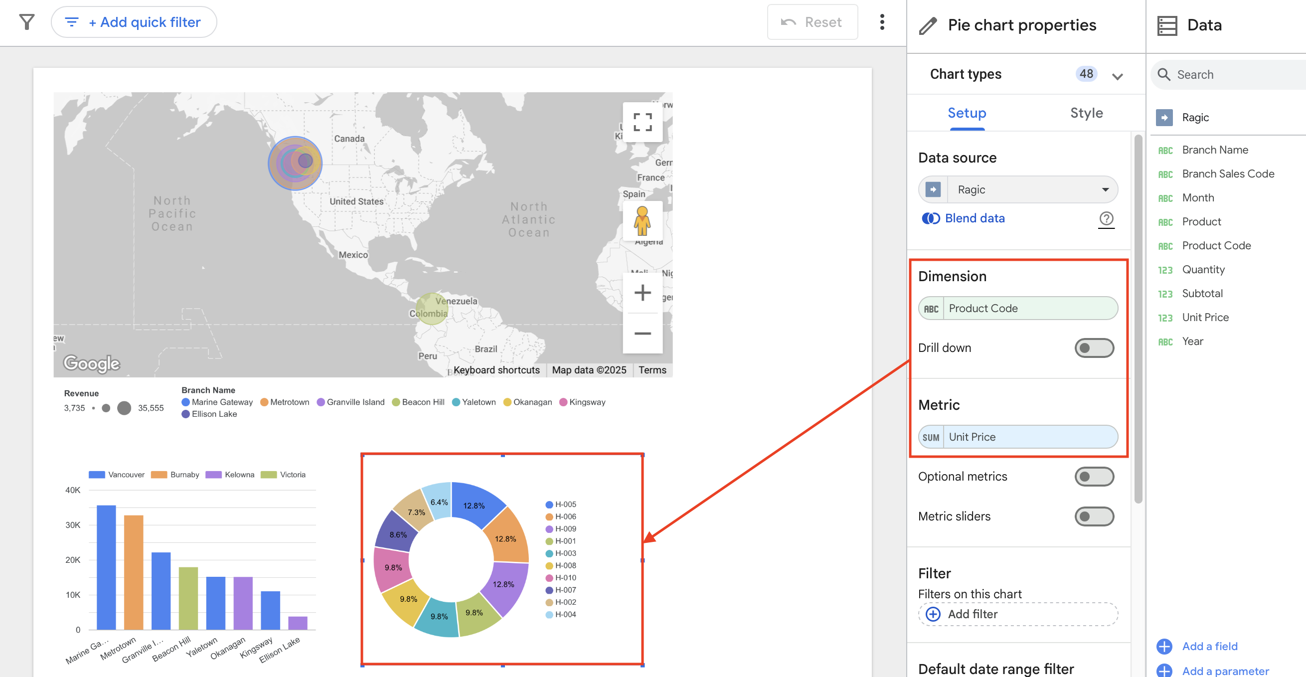
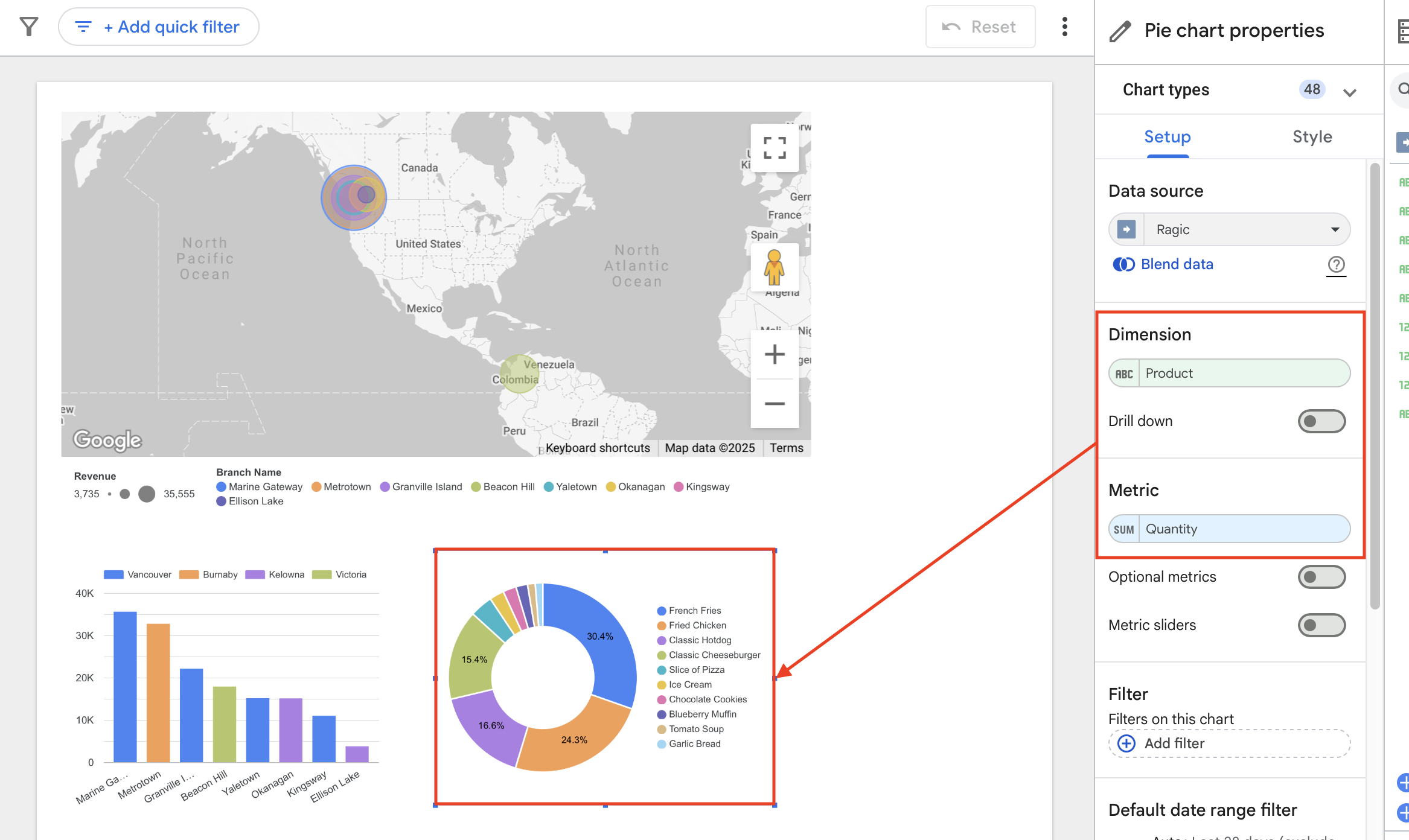
5. Simply change the "Dimension" to "Product" and the "Metric" to "Quantity," and the chart will instantly update, leaving you with an informative chart of the best-selling products!
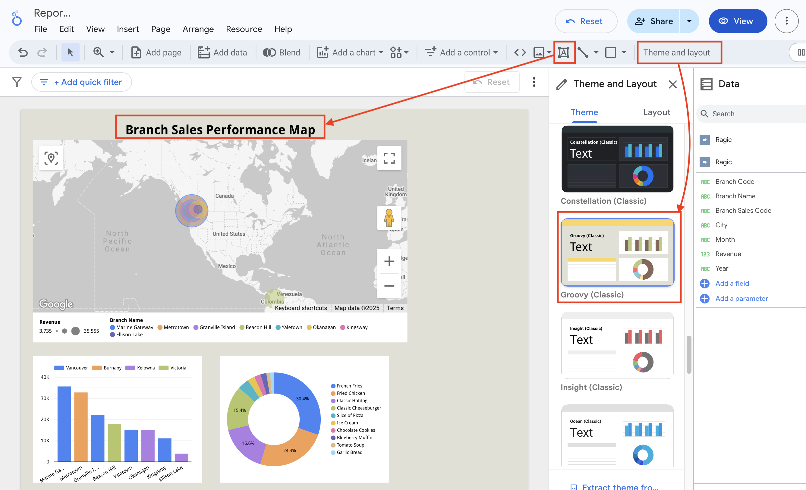
If you'd like to make your layout more colorful, you can use the "Theme and Layout" button to select a suitable color scheme and layout. Additionally, you can use the text tool to add titles to each chart to help readers quickly understand the key information presented in each chart.
If you're just starting out and downloaded the sheets from our sample database to test on Looker Studio, you might have noticed that the download sheets are not linked to each other, making it difficult to compare or integrate data within Ragic.
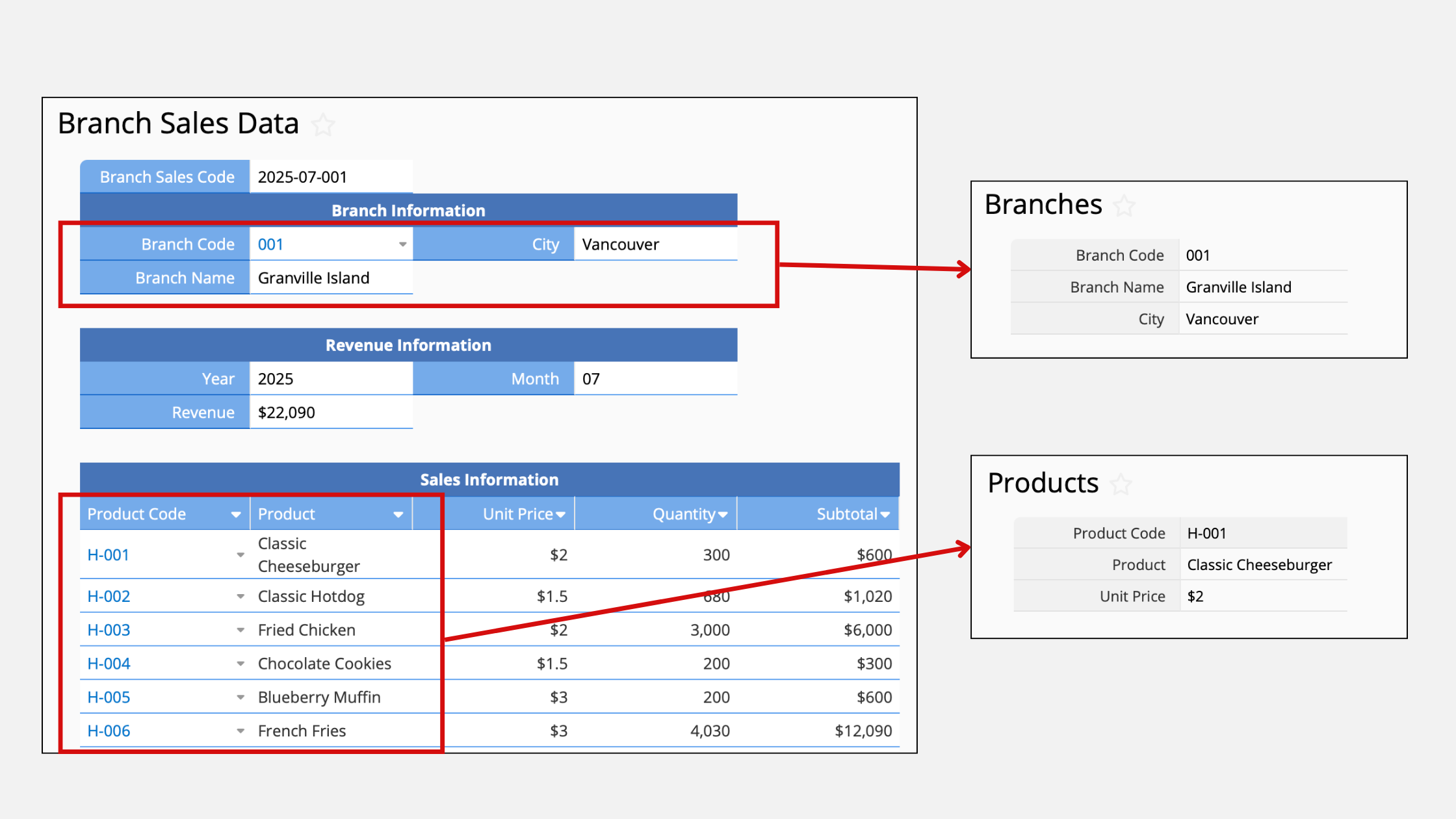
One of Ragic's greatest strengths is the ability to easily link sheets and create data relationships. The complete approach in the sample database involves creating separate sheets for "Branches" and "Products," then linking them together using Ragic's Link and Load feature. Subtables are then used to record sales details for each branch. You can refer to the instructions below and try it yourself!
1. First, create a sheet for your branches and one for your products, organizing the basic information for all branches and products. This makes it easy to quickly select the branch and product when entering information in the Branch Sales Data sheet. Using the link and load function facilitates a clear record of sales data for each branch and each product every month.
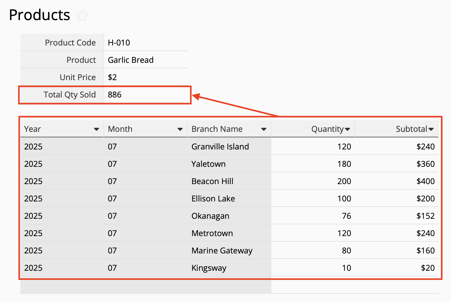
2. If you want to see the total sales of each product in the Products sheet, we can use the "New Sheet from Subtable" feature to create a sheet from "Branch Sales Data."
3. Return to the Products sheet. By using the "Show References from Existing Sheets," you'll be able to see all the sales records for each product in a subtable below each product information. You can then use Formula to automatically calculate the total quantities and sales of each product.
While creating a chart on Looker Studio only requires 2 sheets, this type of database design and data relationships can provide greater flexibility when it comes to data maintenance, filtering, analysis, and future developments. You can refer to our example to create your own clear data structure!
 Thank you for your valuable feedback!